Showing posts with label commercial work. Show all posts

86 Creative Case Study: Oxygen Hair The Before & After


Before & After: With the project finished, it's a good time to have a quick look at the 'before & after' pics and to discuss some of the different aspects of the job. As you can see there is quite a big difference between what we started with and where we ended up.

Oxygen Hair Cutters is an upmarket / cutting edge salon that services what you could describe as an affluent area. The
clientele isn't overly young and hip but isn't the elderly either. It's the middle aged, professionals and the like who enjoy a sense of style. The salon also holds bi-monthly art exhibitions with the style of art being modern, abstract and quirky.

The key points of the project brief were:

Create a newer fresher look throughout the salon that embraces the nature of the business and clientele. This was achieved by selecting a new colour palette: black, avocado, silver, donkey & grey.


These colours were then used throughout all communications, including re-painting areas inside and out, adding new lights and furniture pieces such as a new white counter, black work stations and silver mirrors all of which are on wheels so that the salon can be re-configured in almost anyway week by week - further adding to an ongoing sense of freshness.

Re-design the logo that will represent the name in a funky / modern way and to develop an icon / logo to represent 'oxygen' in a visual sense.

This was achieved by going through a heap of fonts and ideas and discussion with the owners until we settled on what they liked and felt right. The icon was meant to be curved and almost modern / organic bubble that could float somewhere between a chemical equation and glyph. Note that the mural elements were also brought into the letterhead to embrace the overall look.


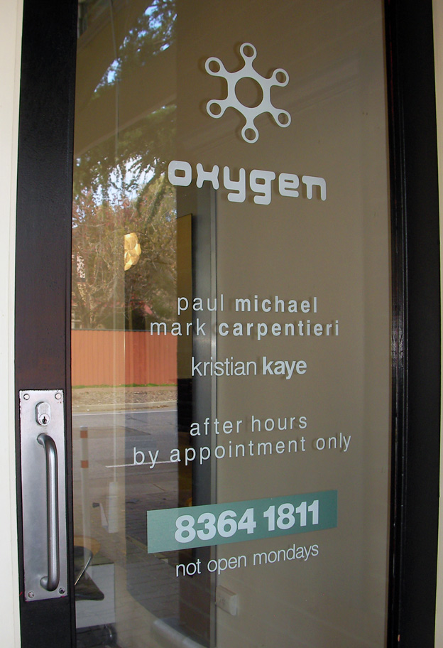
Deliver Signage and identification using the new logo and colours that would re-establish a street presence and clearly communicate what the business was and other relevant info.

This was achieved by removing all of the previous signs and creating new signage that included the name in an 'etchmark' freeze across the windows. this had the added benefit of creating a screen for clients inside sitting in the waiting area and a sense on inclusiveness.

Below this was the 'hair cutters' wording as previously there was nothing in place to explain what the business was. The main rooftop sign was simple and clean and meant to be identity beacon able to be seen from afar. Inside the use of cut out letters added a new dimension to the job.


Create an innovative mural that picked up on the theme of the business that would also add some colour and movement to the interior. This would also work as a nice backdrop for the art exhibitions and provide something interesting for clients to engage with.

The mural was created using stencils, spraypaint and brush and worked in with the interior signage to create a visual from the front to the rear of the inside of the building moving across various background colours of the selected palette. The mural picks up on elements of the decor, signage, logo and iconography and only used the selected colours.


In the end this was a great project to work on with great people and demonstrates what 86 Creative can do across many mediums to deliver innovative visual communication solutions.

It was completed with little fuss and on budget and has received some really positive feedback. So if you've got a project that you think we can help with, why not get in touch, give us an email and we'll see where it takes us!

For more information on this project, please check out the previous posts which go through the work on a step by step basis.

Enjoy.

86 Creative Case Study: Oxygen Hair - The final look.


So here we are the job is complete and the client happy!

This was a great project and involved all of the following professional services that 86 Creative can deliver:


Art Direction & Graphic design - The redevelopment of the name and logo along with the creation of the mural artwork and colour selection throughout the project, ensuring consistency of the overall style, including selection of decor.

Custom Mural Artwork - The painting of the interior mural across the walls featuring various style elements that brought the whole project together in one art piece.

Signage
- The design and application of all the sign elements for the interior and exterior using a range of quality materials to meet the job specifications needed for ongoing durability.


All of these aspects are important to consider when creating project like this. We call call it visual communication solutions and that's what 86 Creative can deliver for you too.

If you have a project coming up big or small or just need to get a little creative, then just give us an email and we'll see what we can do.

86 Creative Case Study: Oxygen Hair Part 3


GRAPHIC DESIGN & LOGO DEVELOPMENT

As a part of the overall project, the development of an all new logo was a must.


After going through a lot of different ideas and concepts we finally arrived at the oxygen icon and font combination above. We played around with all sorts of colour combinations within the selected palate and then ran it out across all visual elements including: graphics, letterheads, cards, stickers, signage and mural.

The oxygen icon is meant to represent the oxygen chemical symbol, being round and like a bubble and still almost like the letter 'o', while the word has been represented in a modern style font but with curved edges to keep inline with the more rounded icon. The letter head and business card uses elements from the mural to tie in with the overall theme.

NEXT UP: The signage elements

In the mean time you can see more 86 Creative Graphic Design right here.

86 Creative Case Study: Oxygen Hair Part 4


The Interior Signage:

The foam cut letters are a great addition to the overall job.

Not only are they light but can be painted in any colour and placed almost anywhere. This is a real feature of the interior make over. The colours selected are the same as the mural and with the three different sizes used add some extra bounce to the overall project. The front doors were also painted and new matching details put up in computer cut vinyl. See more signage details in the Exterior signage post.

86 Creative Case Study: Oxygen Hair Part 5


The Exterior Signage.

The outside of the salon did not escape the make over either....

The exterior of any shop is always important as it's usually the first time someone see's the style of the business. Signs are also important for identification and in conveying important information that the client will need to know, such as opening times and phone numbers.

The graphic design elements were recreated and used across all aspects of this project, which included selected and matching colours for the signs to ensure that there was consistency in the overall look.

The signs were completed using high quality computer cut vinyl.


86 Creative Signage Spotlight


Graphic Design for client signage

Artwork Developed for use on Banner Signs 2009

86 Creative Illustration Spotlight


Custom Window Display for '96'

86 Creative Signage Spotlight


Custom Vehicle treatments for City Doors & ISS Security.

86 Creative Graphic Design Spotlight


Commercial Work for Freedom Hotels
The brief was to develop new logos, fact sheets and other marketing collateral.