86 Creative Case Study: Oxygen Hair Part 1


BEFORE:

It's not every day that a client rings to say "we need a complete overhaul".... but when they do 86 Creative is ready for action!


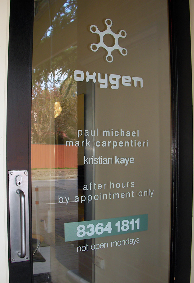
This was a great job and the gang down at Oxygen Hair we're fantastic to work with too.


So this project makes for the perfect case study illustrating what 86 Creative can do.


As the images illustrate above, this hair salon was ready for an update. They operate in a up market location with a clientele to match. The brief was to create something original, fresh and cutting edge without being too over the top or cliche.


The project called for new graphic design elements, new interior & exterior signage, a fresh new interior mural as well as colour coordination and interior styling, all of which was delivered by eighty six creative.


86 Creative Case Study: Oxygen Hair Part 2


AFTER:

So what we have here are the interior aspects of the project.

A vector based mural in the new theme colours which were: avocado, light grey, dark grey and black.


The salon is known to have elaborate floral features that change every week, so this was a great fit with the four colour mural, which combined a free flowing natural theme to compliment the floral arrangements. It also represents a fresh change along with the word oxygen.

Finally, it combines various hair dressing elements which are interwoven throughout. The mural extends from the very front to the very rear of the salon and changes as it presents on each wall colour to create ongoing contrast.

The mural was completed in aerosol, while the doors and windows were painted in gloss enamel.

Added to the mural were new interior stylings, such as light fittings, lamps and a new front desk all in complimentary colours to create a seamless finish.

Next up: the graphic design elements.

86 Creative Case Study: Oxygen Hair Part 3


GRAPHIC DESIGN & LOGO DEVELOPMENT

As a part of the overall project, the development of an all new logo was a must.


After going through a lot of different ideas and concepts we finally arrived at the oxygen icon and font combination above. We played around with all sorts of colour combinations within the selected palate and then ran it out across all visual elements including: graphics, letterheads, cards, stickers, signage and mural.

The oxygen icon is meant to represent the oxygen chemical symbol, being round and like a bubble and still almost like the letter 'o', while the word has been represented in a modern style font but with curved edges to keep inline with the more rounded icon. The letter head and business card uses elements from the mural to tie in with the overall theme.

NEXT UP: The signage elements

In the mean time you can see more 86 Creative Graphic Design right here.

86 Creative Case Study: Oxygen Hair Part 4


The Interior Signage:

The foam cut letters are a great addition to the overall job.

Not only are they light but can be painted in any colour and placed almost anywhere. This is a real feature of the interior make over. The colours selected are the same as the mural and with the three different sizes used add some extra bounce to the overall project. The front doors were also painted and new matching details put up in computer cut vinyl. See more signage details in the Exterior signage post.

86 Creative Case Study: Oxygen Hair Part 5


The Exterior Signage.

The outside of the salon did not escape the make over either....

The exterior of any shop is always important as it's usually the first time someone see's the style of the business. Signs are also important for identification and in conveying important information that the client will need to know, such as opening times and phone numbers.

The graphic design elements were recreated and used across all aspects of this project, which included selected and matching colours for the signs to ensure that there was consistency in the overall look.

The signs were completed using high quality computer cut vinyl.


Melbourne